
Blog

-
10 minutes
read
Why purple and blue are the new green and yellow: learn how colours have the power to influence our perceptions and emotions, and how the wrong colour can make or break a product. Let's channel our inner Bob Ross and paint some chaos together and see how this small change can make a big difference in the resilience of our systems.

This content would definitely be approved by Bob Ross.
As a UI designer at a deep tech company, I take my colours seriously. In fact, some might even say I have an unhealthy obsession for them (how ironic for someone who only works in black and sometimes, very very dark grey). I mean, who doesn't love a good colour scheme? That's why we recently made a change to the colours of our platform, and let me tell you, it was no small task. It's like being a mad scientist, but instead of experimenting with chemicals, you're experimenting with colours. And if you're not careful, you might just create a (colourful) monster.
But before digging any further into this topic, let's take a step back and give some context about Steadybit, chaos engineering and resilience.
May the Chaos (Engineering) be with you (or: what is this stuff?)

My face when I try to explain to my mom what I̶ ̶d̶o̶ ̶f̶o̶r̶ ̶a̶ ̶l̶i̶v̶i̶n̶g̶ my company does.
In today's fast-paced digital world, it's crucial that our systems can handle all kinds of unexpected events and still keep running. You know when your system is running smoothly, but suddenly something goes wrong? Maybe your website crashes or your app freezes right during the Christmas shopping. What wouldn’t be fun, am I right? Well, chaos engineering is all about creating and injecting controlled chaos to see how your system responds, in order to proactively finding possible solutions and fixes to any problems that might arise in the future (or during the Black Friday). By intentionally causing chaos and seeing how your system responds, you can identify weaknesses and make improvements. It's like a workout for your system, and the end result is a system that's stronger, more resilient, and better able to handle anything you throw at it. And trust me, you want your system to be resilient. Because if it's not, then you're in trouble.
So, you might be wondering, how on earth can you intentionally create chaos in your system? Well, fear not, because Steadybit is here to help. Steadybit is a powerful tool that lets you inject controlled chaos into your system through an intuitive (and beautiful) user interface (UI) or, if you prefer, command-line interface (CLI). By setting up and running experiments with Steadybit, you can stress-test your system and see how it responds to unexpected failures or sudden traffic spikes.
It's all about building resilience. By intentionally creating chaos scenarios, you can identify hidden flaws in your system and make adjustments to ensure it's more resilient in the face of adversity. Steadybit lets you create custom experiments to check, attack, and stress your system (or parts of it), so you can fine-tune your system and be prepared for anything that comes your way.
It might sound a little crazy, but trust us on this, it's all in the name of making your system stronger and more reliable. Plus, it's kind of fun to watch your system squirm a little bit under pressure.

Beware of SRE. Always.
So, now that we have some context on chaos engineering and resilience, let's get back to those color changes – I promise it'll all make sense soon.
The Colour Chronicles: one UI Designer's quest for the perfect palette
Now, I know what you might be thinking. "Who cares about the colour of an attack, a check or a loadtest? It's all about the chaos, baby!" And sure, chaos is great and all, but let me tell you, colours matter.
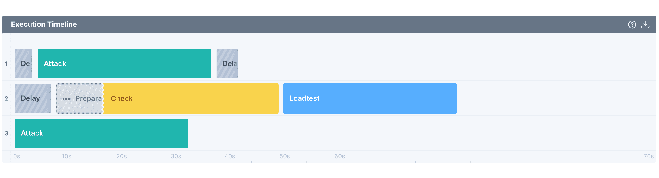
The old colours in our platform in the Execution run view. Can you guess which step is successful and which one has a warning?
The old colours we were using were a bit problematic: green for attacks and yellow for checks. Don't get me wrong, I do love some green. It's the colour of four-leaf clovers, nature, and even the Incredible Hulk. But when it comes to chaos engineering and meanings behind colour, green can be deceiving. It's sneaky and misleading, making you fall for its trap of false security. "Oh, everything's fine here," it says. "No need to worry." And then BOOM! Chaos hits you like a ton of bricks –especially if the experiment is concluded, there is an error, but your attack is still green.
And don't even get me started on yellow. It's like the colour equivalent of "proceed with caution, something might not be right here." Which is all well and good if you're driving a car. But you may end up feeling perplexed by the experiment output, especially when a successful check is painted in warning-yellow.
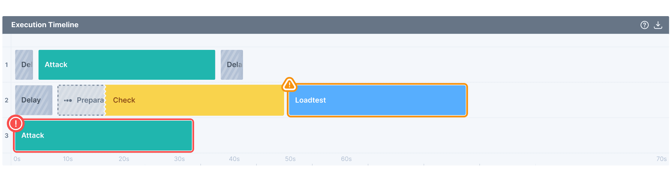
Well, you guessed wrong. Here’s the answer. It’s confusing, am I right?
Finding the right colours for your product can be a real nightmare. It's like trying to pick the perfect outfit for a first date –you want to make a good impression, but there are so many options that it's easy to get overwhelmed. Trust me, we know all about it – we've gone through so many trials and errors trying to find the perfect colour combination that you can’t even imagine.
At first, we thought it would be easy. Just pick a few colours that we like and call it a day. But boy, were we wrong. We quickly realized that picking colours for a web product of this entity is a science. There are so many factors to consider, like the psychology behind colours, the branding of the product, and the overall aesthetic of the design. It's like trying to solve a Rubik's cube while blindfolded.
We experimented with bright colours, muted colours, pastels, neons, and everything in between. We even tried closing our eyes and randomly selecting colours on the colour wheel (spoiler alert: that didn't work out at all).
But then, after many trials and errors, we finally found the perfect combination: vivid purple for attacks, and a nice light blue for checks. These colours are like the Batman and Robin of the colour world. Blue is calm, like a gentle breeze on a summer's day. And purple? Purple is just plain cool. It's like the James Dean of colours.
But we didn't stop there. At this point, we also had to change the colour of the load test, which used to be light blue. But with the new check colour, it was just too darn similar. So we went with lilac. Yes, lilac. It's a lovely shade of purple that's just different enough from the attack colour and the check colour to make everything clear as day. And let's face it, who doesn't love a good lilac?
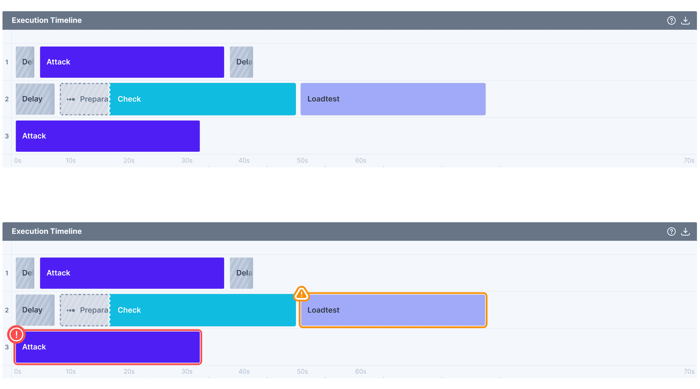
The new, beautiful and completely non-misleading colours.
These colours are not only aesthetically pleasing, but they make the attacks, checks and load tests stand out on the screen. And the best part? They don't carry any preconceived notions or meanings. When people see these colours, they know they're in for some serious chaos.
But you might ask, "Why change the colours? They're just colours!" Well, my dear friends, let me tell you something: colours are never just colours. They have the power to influence our moods and perceptions. Think about it, have you ever walked into a room with red walls and felt energized? Or ever felt a certain way just by looking at a specific colour? Maybe a calming blue, an energizing red, or a cheerful yellow? That's because colours have an impact on our psyche. They add flavour and personality to everything from clothes to products. But when it comes to designing a website or product, colours are like the VIP guests at a party. They can also send all sorts of messages. A bright and bold colour scheme? That says, "Hey, we're fun and playful!" while a muted and subdued colour scheme screams sophistication and class. Even tiny changes in colour can affect how people perceive a product's value, quality, and trustworthiness. It's like colours have their own personality and backstory.
As a UI designer, I know too well how the right colour scheme can make or break a product. In the case of our platform, we believe that this small change will make a big difference. It will improve the user experience, make the chaos more fun, and ultimately lead to more resilient systems. And who doesn't want more resilient systems? I mean, come on, that's just good business. And let’s be honest: who doesn't love a good colour-coordinated experiment?
And when it comes to our platform, we want to make sure that the colours we use don't convey any unintended meanings. We want to make sure that when you see purple, you think chaos. Not royalty, not passion, not Barney the dinosaur. There's no confusion, no misinterpretation. It's just pure chaos.
And let's not forget about accessibility. The new colours we chose have a nice contrast, making it easier for everyone to see and read. We want to make sure that everyone, no matter their visual ability, can participate in the chaos and have some fun.
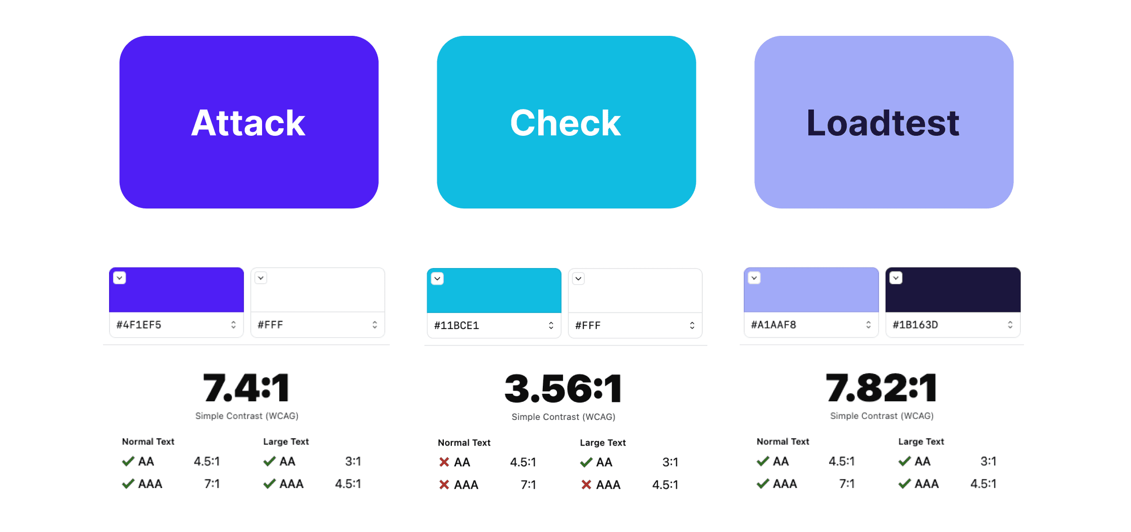
Contrast check for the new colours used. Yes, the light blue has some difficulties, but we’re actually using it with large texts or icons only.
Conclusions
So there you have it, folks. Another day in the life of a UI designer obsessed with colours. And the next time you see purple, blue and lilac on our platform, just remember: it's the little things that can make a big difference. It's not about being safe or successful. It's about pushing the limits, testing the boundaries, and causing a little chaos along the way. And who knows, maybe one day we'll even have our own colour wheel for chaos engineering. Just don't ask me to wear anything other than black (or very very dark grey).
Stay colourful, my friends.